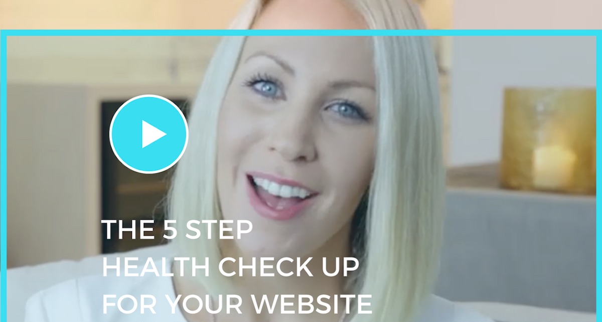
Your website is like a 24hr salesman for your studio. It is the online face of your studio. So we want to make sure that we have our best foot forward.
So today I’m going to share with your five little things to check on your website. Even the smallest tweaks we make today can help you attract and enroll more students.
If you think about when someone is searching for a studio and they have them all lined up. They go from studio website to studio website thinking “Which one do I want?”
The one that compels the most, the one that connects the most is the winner.
These five tips are going to show you how to connect and convert more visitors to your website and turn them into beautiful students in your studio.
Tip 1: Does your website put your student in the spotlight?
This is something I am really passionate about. I want you to read over the language you use on the homepage. Scroll down and see if the language you are using is talking more about the studio or the student?
A lot of studio websites are saying “We’ve been running for x amount of years and we have sprung floors and we have top of the line music equipment.” It’s all about the studio. There is a lot of “I” “We” “Our” language as opposed to talking about the student and what they are looking for.
How are they going to feel? What are they going to experience? You need to really communicate what you do in a way that is about them.
There’s so much marketing of studios these days where it’s about “Here’s what we do. We do early childhood music classes, we do jazz, ballet, tap, hip hop classes.” But really that’s not always selling. What we’re selling is the experience for the students.
I want you to check over the language on your website. Every time there is an “I” or a “We” or an “Our”, shift the language around to be more about the student and more about what they are looking for in a studio.
Tip 2: Does every page lead to another page on your website?
Think about your website as a conversation. I might ask a question and you may ask a question in return. This is the same for your website.
So often when I visit studio websites I will go to their “Programs” page and they say “We run these different programs.” and there’s nothing at the bottom of the page.
If you think of your website as a navigational maze. We want to be saying “go here.” and then “would you be interested in learning more about this?” Keep them on your website as long as possible.
Go through your website and see if you have a call to action at the bottom of each page. Something like a link or a button. Something along the lines of “Would you like to learn more about our programs?” or “Click here to view our timetable!” or “Read our FAQs.”
The name of the game is to keep them on your website for as possible.
If we’re not giving them an invitation and a direct clear link to find out more, we’re losing the opportunity to keep them connected and to keep them engaged.
P.S. If you have a Google Analytics account one of the best things you can do is to look at your statistics and see which are the five most popular pages on your website. These are the five pages that you should be continually linking people to go and visit within your site. Use this data to keep your visitors engaged on your website.
Tip 3: Make sure you have a testimonial on every page of your website.
Testimonials are your best friend! A little secret tip to get the best out of your testimonials – the best testimonials are the ones that say “I was here and now I’m here.” For Example, “I was nervous about whether this studio was worth the investment but I’ve seen my child completely blossom within months.”
Testimonials are an opportunity to overcome objections.
Big objections your families may have are; costs, location, take up too much time in their schedule, social connections, supportive environment. If you can pinpoint the big objections as to why a student may not come to your studio, see if you can encourage testimonials from your families that overcome them.
Another example: “I’ve been to other studios where it was all about the performance, but here at Chantelle’s dance studio it was all about making us feel warm and connected and supported in the environment.”
Think of the biggest objections your families may have for coming to your studio, then craft a few little sentences that would sound like a testimonial. Sitting down with one of your parents in the studio and ask which sentence resonates the most with them. They will usually find one that they completely agree with and that they would be willing to put their name to as a testimonial. This will create high powered high converting testimonials that will attract more students to your studio.
On every page of your website you can be countering every objection based on powerful testimonials. Use your testimonials strategically to create more authority and more compelling conviction as to why people should choose your studio.
Tip 4: Check you have an abundance of calls to action on your website.
A call to action is something where you are directly prompting a visitor to do what you want them to do.
We want to have a variety of calls to action on your website that appeal to different people.
It might be something as direct as a link saying “Click here to enrol for an introductory class.” It may be “Click here to download our welcome kit.”
You want to make sure that on every page you have at least one call to action that is going to encourage them to put in their email address. This enables us to continue educating and nurturing them into enrolling.
The worst thing to happen is if a visitor comes to your site and immediately bounces off never to be seen or heard from again. What we want to do is to have some way of connecting and continuing to stay in touch with them. That’s why having an email opt in is a great idea on your website.
Tip 5: Check your website is mobile responsive
Right now, grab your phone and bring up your website on your mobile device. Now click through every single page.
If you’re finding that you have to zoom in or scroll around to find text, what you’ll find is that it’s not a great user experience. People will be annoyed. If you go into your analytics, you will find that most of the traffic coming to your website is coming via mobile.
If we’re not creating an experience that is easy they will bounce off your website.
Another reason that this is incredibly important is that recently Google has announced that they are penalising websites that don’t have mobile responsive design.
If your website is not working well on phone then Google is not going to reward you with high rankings in search results. We want to avoid this at all costs!
To get around this you can have a custom mobile site created for a couple hundred dollars. Ideally we want a theme that is responsive so it works the same on a mobile, tablet and desktop.
Make sure you check your online enrolment forms. Often these forms don’t convert very well.
Give your mobile site a score out of 10 for your mobile user experience.
If you can nail these five things on your website you are going to see more enquiries coming in and they are going to be more educated on what you do in your studio. You’ve already answered their questions so you won’t have to be going back and forth via email. It’s a win-win situation.
If you would like more information on how to make your website and running your studio easier, we have put together a Studio Owner Toolkit. It contains all our favourite tech tools for running a studio. Everything from design to our favourite productivity tools to where to find images to use on your social media. Everything you can use to make running your studio easier is contained in this one downloadable PDF.
>>Download your FREE Studio Owner Toolkit Here<<
By Chantelle Bruinsma Duffield of Studio Strategist at StudioExpansion.com.


