March 4-24, 2021.
Accessible through www.sfballet.org/sf-ballet-home.
Just about all dance artists have the experience of a dance really becoming what it is in “tech week” — when lights, projections, costumes and music resonating through a performance space truly make a work come to life. Choices of color and shape can enhance meaning and the experience of viewing a work, or they can bring distraction and confusion. An aesthetic of a dance work can build an atmosphere that pulls audience members in, or one that’s simply discordant. San Francisco Ballet’s Digital Program 03, in its virtual SF Ballet @ Home program, illustrated the power and importance of creating a clear aesthetic and atmosphere. The program featured two pre-COVID performances, filmed at the War Memorial Opera House in San Francisco, and a film premiere.
Alexei Ratmansky’s Symphony #9, which San Francisco Ballet first danced in April of 2014, opened the program. Virtuosity and dynamism filled the air from the first note and step. A robust instrumental score (by Dmitri Shostakovich) propelled quick little jumps, extensions and turns. It was all quite neoclassical, but for jazzy gestural flourishes — emblematic of a “post-postmodern” openness to inspiration from other dance forms. The backdrop of fading blue (from George Tsypin) and velvety costumes, in shades seemingly inspired by the colors in a forest (from Keso Dekker), tied off a modern wrapping around the present of the neoclassical movement. In a Balanchian sense, even as social dynamics arose, there was no narrative at play except for the union of music and movement.
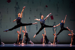
A drastic change in tempo, to something much more adagio and mysterious, brought movement that was more grounded, exploratory rather than boisterous. A pas de deux in this section had complex lifts but also moments of simple turning with a clear port de bras and a weighty pause. Corps members lunged in through the wings, port de bras reminiscing swimming through the air — which they shifted into passés before their partners joined them for a lift.
Like the simple turn and port de bras of the preceding pas de deux, it was a clear motif — one that built a sense of continuance and circularity. There may not have been a “narrative”, per-se, at hand, yet audience members at large could identify with a sense of moving through with seeming calm and composure — yet remaining back in the same place yet again, while an air of something not quite right lingered. Our imaginations could create our own narratives within these structures. That can be the fun, and meaningful, part.
Part way through came the lights dimming down and two dancers (a ballerina and a danseur) slowly melted to the ground until they lay on their back. A backdrop of silhouettes of people holding red flags was visible as lights came back up. I didn’t fully understand this creative choice, and preferred the open possibilities of the faded blue backdrop seen before in the piece.
As the people in the drawings seemed to fit the model of “respectable, well-to-do” people in society, perhaps it was a commentary on conformity and living a life prescribed to you. The sense of coming back to the same place again would align with that theme. It can also be fun for our imaginations to conjecture possibilities within creative choices that we don’t quite understand! Nevertheless, the movement remained effervescent and thrilling, with excellent performances from San Francisco Ballet’s top-notch artists.
The energy crescendoed toward the end, bringing back motifs with a speedier tempo while also adding new ingredients into the mix. As the lights went down, the corps leapt to offstage and a sole dancer remained center stage (Wei Wang) — jumping high and spinning fast. As a very intriguing choice, this seemed to center the focus back on individual experience. This ending could be interpreted as an assertion that that’s what it comes down to — how we each individually experience the world. Absent deeper analyses, it was all pleasing to experience.
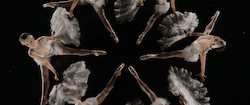
Wooden Dimes was the program’s film world premiere. Christopher Dennis served as executive producer, Lindsay Gauthier as editor and Heath Orchard as director of photography.
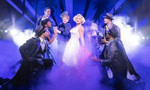
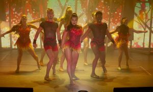
The cast at any particular point didn’t seem very large, so it’s conceivable that the dancers filmed unmasked in “pods” (as film and television has been doing for several months). Opening with showgirls in their dressing room, it had a clear and compelling 1920s atmosphere. Excitement and camaraderie filled the air. A man entered (Luke Ingham), leading into a passionate, graceful pas de deux with one of the ballerinas (Sarah Van Patten), who was becoming a central character.
The movement was largely classical, but jazzy inflections paid homage to the context at hand. The next scene portrayed Ingham’s character seemingly at work, pounding and exclaiming with his body. Men in accountant shields circled around him, as if doing his bidding — or were they demanding things from him? Switching perspectives from there, the showgirls performed joyfully. Van Patten’s character differentiated with black stripes on her white dress while all other dancers wore all white (costume design by Emma Kingsbury). All scenes seemed to have been filmed on a grand theater’s stage, the lines between Marley pieces visible. That choice brought a Spartan feel that felt supportive of the overall work (scenic properties design by Alexander V. Nichols, lighting design by Jim French and Matthew Stoupe).
Van Patten’s character danced with a mysterious pair (Madison Keesler and Nathaniel Ramirez). A pas de deux from dancers in red and black followed, with lower lighting and the score becoming lower and sharper in tone. This pair appeared to be tempting the first man we met, the first our main character had danced with, with something sinister. They tugged at him and manipulated his body. The lines between imagination and reality seemed fully blurred. A cohesive aesthetic, paired with clever choreography, made this narrative clear yet also flexibly open to interpretation. Our heroine danced again next, her dress this time with colored stripes. She seemed joyful, even if pensive. Something had shifted!
She danced with breath and expansion, an arabesque held for just half a breath longer having the potential to thrill and invigorate. Once again wearing a dress of many patterns (changing into which seemed to signify transition of sorts), Ingham’s character returned. They intertwined, shared weight — was this redemption? They danced together again with passion and grace, just as they did before, but a new resonance filled the air between them. Challenges to the bonds between us can give those bonds new vibrations, for good or ill.
It all went silent toward the end, and all that was audible was the sound of the heroine’s breath. Lights slowly faded down. Many endings to dance works feel rushed, without the residue of the emotional weight of what just happened having time to linger. Not so with this ending. Consistent with that old time movie feel, “The End” flashed across the screen. That residue lingered in me, along with many questions — with art, often more meaningful than having answers.
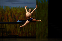
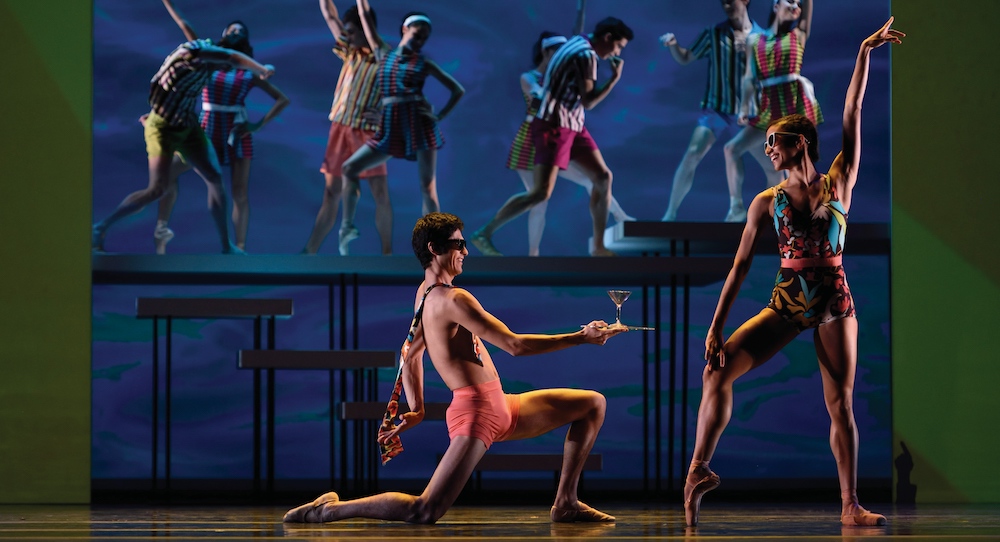
Swimmer, premiered on the War Memorial Opera Stage in April of 2015, was a visual exploration with Busby Berkeley-esque surrealistic images. Yuri Possokhov choreographed the work. Scenic design was from Alexander V. Nichols and video design from Kate Duhamel. From the 9-5 workday to poolside recreation, movement conveyed mulling about the office, swimming freely, and flirting by the pool.
Moving projections swirled behind the dancers throughout — something seen far more often in contemporary dance than in ballet. It was satisfying visual candy, but a candy with an unexpected flavor that you can’t quite place. “The Swimmer” (Joseph Walsh), meanwhile, embodied free movement through water and air. He had lovely ballon and musicality, reaching with energy traveling far past his extremities yet also with a clear and powerful center of energy.
Beyond him, flourishes for characterization and to convey specific action in the body enlivened a clear and solid classical base of movement. A pas de deux section, seemingly in a context of meeting for drinks at a bar, felt a bit out of place structurally yet was beautifully choreographed and danced. Tension and passion were clear through push/pull dynamics and expansiveness in movement.
A later section in the work, with a large corps of danseurs, had multiple possibilities for meaning — the turbulence of growing older, a storm (within the larger nautical theme at hand in the work), or something else? Whatever the meaning, athletic lifts and powerful leaps were exhilarating. “The Swimmer” held his arms across his chest, as if shivering — yet soon enough he danced big and bold again. Stunning lighting effects made him appear as if swimming deep, juxtaposing projections of a man swimming amidst fierce waves.
The curtain dropped as that continued — certainly an open-ended ending! One could imagine different possibilities for what might happen next, but what felt more meaningful with this work was visual possibility and the sheer power within the human body. While aspects of the work felt unclear, what it delivered was a sheer feast for the eyes and narrative potentials for the brain to chew on. At times, bold experimentation can come at the cost of clarity in art making. Art can’t move forward without that bold experimentation, so so be it, says this reviewer. Brava to San Francisco Ballet for taking chances and reminding audiences just how much creative possibility is out there for the taking — global pandemic or not.
By Kathryn Boland of Dance Informa.


